How do you go about it?
Well, the web is an amazing resource of just about anything. From blog posts, forums to social media name it, everything’s there. I also collected a bunch of ebooks and magazines that showcases brand development. But the one that stood out for me, the one that really influenced me was that of David Airey, Logo Design Love. I came across that and from that moment I started sketches.
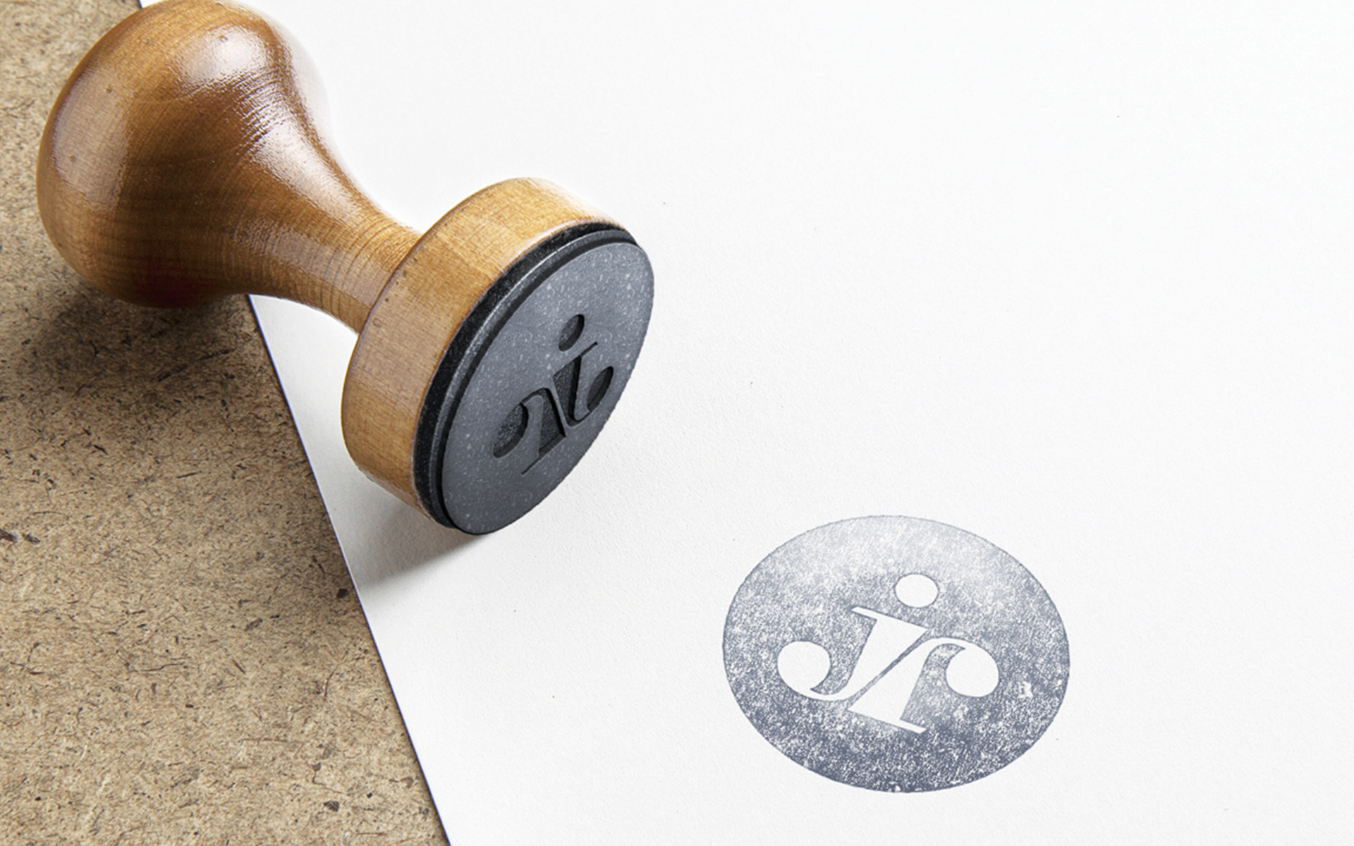
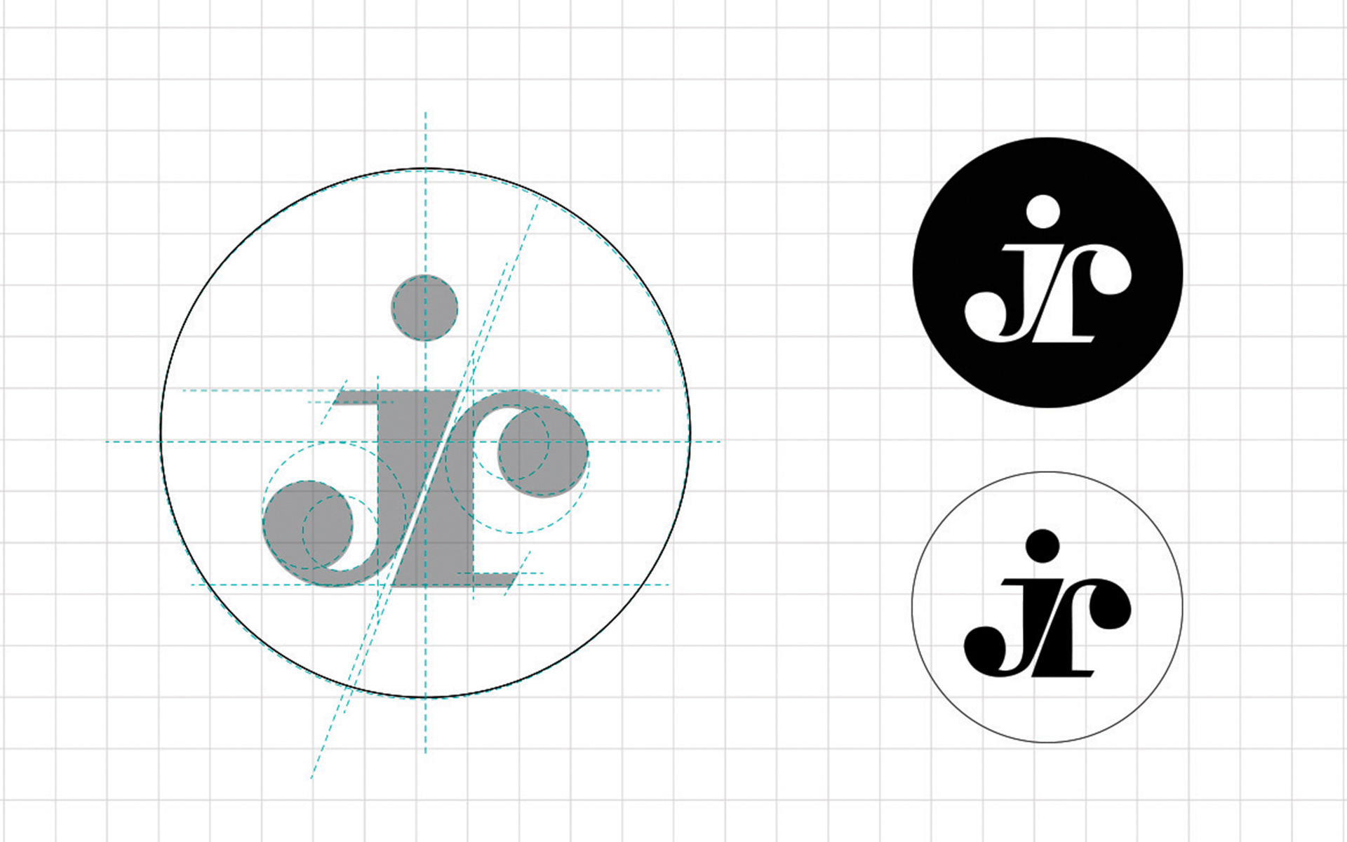
I’ve always wanted something that is simple and coherent and sort of organically formed. So I tried playing around my initials (‘j’ and ‘r’ more like ‘junior’)
I tried different variations, with a dot on top of the ‘J’ and without it, enclosed in a circle and without a circle, a little bit of a gap in between the letters and even tried different colors.
But I seem to always pick the one with the white monogram with the dot on top enclosed in a black circle. :-)